Challenge
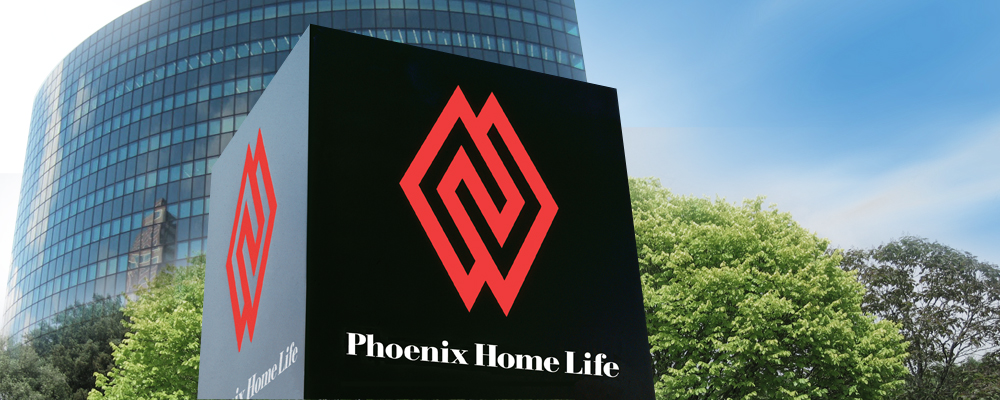
The identity of the new company born from the merger of Phoenix Mutual Life Insurance and Home Life Insurance needed to preserve identification aspects of both organizations, present a union of equals, and convey a focus on the future.
The identity of the new company born from the merger of Phoenix Mutual Life Insurance and Home Life Insurance needed to preserve identification aspects of both organizations, present a union of equals, and convey a focus on the future.
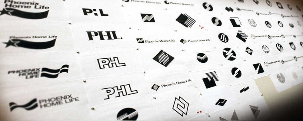
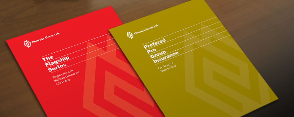
Kass Uehling designed an abstract interlocking symbol to convey the new, equal partnership and combined it with a fresh logotype for the selected name, Phoenix Home Life. We also developed a system to translate the identity throughout all corporate and marketing communications and produced a standards manual.