Challenge
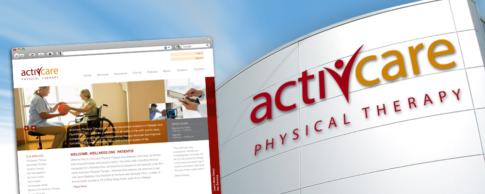
This startup needed an image that is both professional and friendly to appeal to not only the physicians who refer patients, but also to the consumers themselves.
This startup needed an image that is both professional and friendly to appeal to not only the physicians who refer patients, but also to the consumers themselves.
Kass Uehling capitalized on the unique spelling of the name by placing a figure icon literally in the center of the wordmark. The stylized human symbolizes the ‘active’ part of the name and that the patient is the focus of the business. This dynamic solution very simply calls out the nature of the organization.